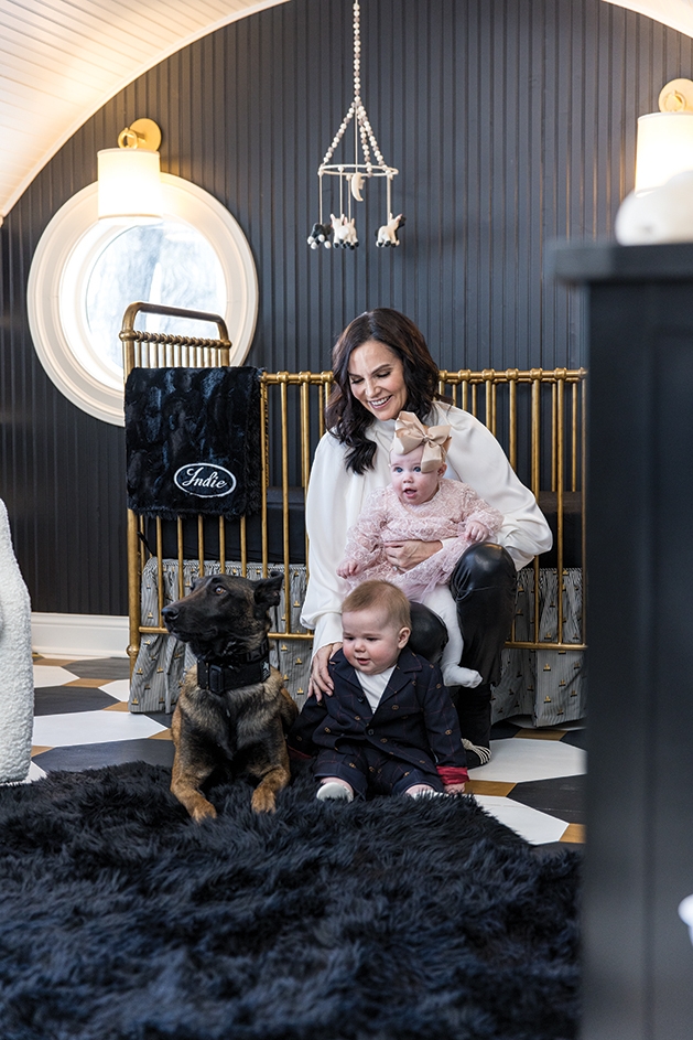
My husband and I are in our 50s and have been married for nearly three decades. We have two adult children (29-year-old son, Sage, and 22-year-old daughter, Enya). We also have mentored and opened our home to exchange students throughout the years. We moved to Minnesota four years ago from New York City to be close to family. My parents also live with us. We love multi-generational living and love having family close. We weren’t done expanding our family, and, through surrogacy, were able to grow our family by two more. Elvis was born on May 29, and his sister, Indie, was born three days later on June 1. A unique story to be sure. —Lynn O’Neil
John and Lynn O’Neil certainly have a “unique story to be sure,” and the couple opened its home to Lake Minnetonka Magazine to share how the rest of the story unfolded when it came to preparing a bespoke nursery that embraced the babies and held onto the loving tale of their arrival.
“We wanted to start the babies sharing the same nursery space,” Lynn O’Neil says. “Since they were being carried by two separate surrogates, we hoped that sharing the room would nurture their bonding, so we needed a plan that made sense for two cribs, two bassinets, two rocking chairs and a changing table/dresser.”
With names like Indie and Elvis, the babes certainly require a nursery that’s big on style and makes a bold statement. “Our journey is a little different,” O’Neil says, so she wanted a nursery that would reflect that uniqueness and a space where cute and cool coexist and practicality doesn’t take a backseat.
The O’Neils turned to Jeanne Anselmo of JJ Designs. She had worked with the family, completing extensive design work and orchestrating a 10,000-square-foot addition to its 1920s home on Lake Minnetonka. (Some of her work at the O’Neil’s home garnered a first place in the 2019 ASID Design Competition.)
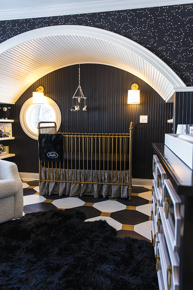
“She has taken the time to really get to know all of us [and] appreciates our story, style and way of life,” O’Neil says. “We wanted the room to make sense with rest of the home décor-wise. She brought the idea of black and gold, and my immediate response was, ‘Yes!’ She also suggested including constellations on the walls with hand-painted stars on the ceiling.”
“I don’t know if it’s having lived in New York City for so long, but black and white has been our go-to colors for years,” O’Neil says. “My husband is one of the founders of The DOGPOUND fitness gyms in New York City and Los Angeles. The color décor of the gym is mostly black. Why not give the nursery some of the same vibe?”
So, it was out with the ubiquitous pink and blue color story and in with elevated black, white and gold tones. “I presented this direction because it did fit the wow factor, and this situation was far from traditional,” Anselmo says. “Also, babies see black and white before they see any color, so I figured it would be visually stimulating for babies, as well as adults.”

Even the floor received an update and ended up being one of O’Neil’s favorite parts of the nursery. When the room was first renovated as a guest room, the original 1920s flooring was painted. “When it was going to be the new nursery, I just decided to add the black and edge the squares with gold to tie together the theme. I also painted the old wainscoting black,” Anselmo says.
Luxe vibe aside, there is an element of practicality that must go into a nursery—after all—diapers! How did Anselmo master mixing an elevated style with practical elements? “We used a beautiful black and gold dresser as a changing table by just adding two changing pads on top,” she says. “I skirted the bottoms of the baby bassinets that looked very modern but are the new trend in baby bassinets (SNOO), and we did shearling-covered gliders. With all the glam, the Diaper Genie just blends in.”
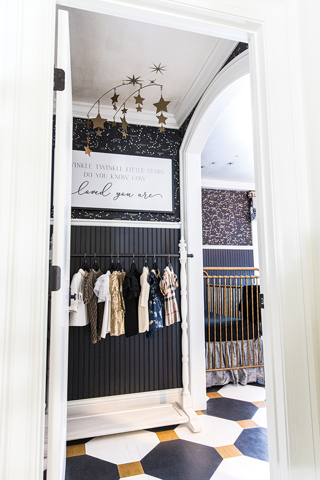
Other featured elements include custom artwork of the babies’ astrological charts, a black sheepskin rug and a wardrobe rack complete with black hangers and hand-painted gold stars. “There are not many elements I would consider to be ‘cute’ in this room other than the adorable babies that get to sleep there,” Anselmo says.
“I do agree that the feel of the room is luxe,” O’Neil says. “All of the adults in the house love to spend time in the nursery. [Anselmo] was able to design a sophisticated nursery with a little edge. We just love it. Elvis and Indie are mesmerized by the stars on the ceiling and the ceiling fixture.”
Room to Play
Anyone with babies knows—they don’t sleep all the time, and they eventually get mobile and curious about life outside the nursery. A playroom is in order, and Anselmo had ideas for that room, as well. “We are incorporating black again, but since this space is right off the kitchen and the kitchen space is very much about texture rather than color, this space will be a bit calmer,” she says. The room features an animal print black, white and grey carpet with a black and white Italian sectional. “The color will come from some fun pillows and, of course, all the toys,” she says.


