Interior designer Gayle Crummer knew the home had potential. Located in Orono, it had wonderful space, a charming villa exterior and elegant 11-foot ceilings. But the house was also limiting for the family of four who had just purchased it.
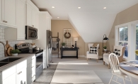
In the home’s living area—kitchen, eating area and family room—the design was inconsistent; the interior was a mixture of country cabin and contemporary design, neither of which matched the exterior. Additionally, there was quite a bit of wasted space. The family didn’t use the desk area in the kitchen, and the cabinets and shelves in the family room and kitchen didn’t take advantage of the height of the rooms. So Crummer set out to create a space that boasted of both function and European style.
The renovation began with the center of the space: the fireplace. In order to keep this three-sided fireplace from feeling too contemporary, Crummer hired Minnetonka painters Eiswald & Company to change the look of the chimney. An angled, limestone chimney would give a decidedly European feel, but real limestone was too heavy for the structure. Instead, Eiswald & Company painted the chimney to look like limestone. The end result gave the space clean, traditional lines while creating a piece of architecture that emphasized the Old World style and took advantage of the room’s high ceilings.
With the focal point squared away, Crummer turned her attention to the family room. She wanted to create a space that would meet the family’s daily needs but also allowed for entertaining. Two leather and fabric couches provide seating for the family of four, and ottomans and the chairs in the eating areas can be brought in for additional seating. With this in mind, Crummer ensured the ottomans and eating area chairs were upholstered in material that would easily match the colors and fabrics included in the family room. Now, she says, the family can quickly and gracefully transform the area from a cozy night at home to a hospitable party room.
The family room also houses a full-service bar. With its sink, fridge, dishwasher and TV, the bar is so convenient that guests can serve themselves without the host needing to venture into the kitchen area. “The bar has unexpected utility,” says Crummer, “but because it’s in a family room, it’s also discreet.” For example, the bar’s sink is located on the far right of the countertop. This allows for a greater prep area, but it also keeps the sink more hidden from view. “When the bar isn’t being used, it looks like a beautiful piece of furniture,” she says.
No room demands more functionality than the kitchen. Crummer knew this busy family needed a kitchen layout that would allow for hectic weekday mornings and large holiday gatherings. She began by replacing the desk area in the kitchen with a fridge wall. Deep drawers, full of pantry goods and snacks, surround the refrigerator, while a wide, pull-out shelf above stores serving trays and platters.
Across the kitchen from the refrigerator wall, the family requested a breakfast station, adjacent to the kitchen sink. Inside the designated cupboard is everything one might need for a morning meal, including coffee maker, toaster, cereal boxes, peanut butter and bread items. A small fridge right below the cupboard contains milk and juice. “It’s all right there,” says Crummer. She points out that it makes weekday mornings easy for the family, but that it also makes overnight guests feel at ease. There is no need to set out items the night before, nor does anyone need to dig through cupboards and drawers to find needed items.
“How we organized these three rooms results in every item having a home,” says Crummer. “Now, it’s little work to switch from everyday life to entertaining. Things also stay picked up, which leads to clutter-free entertaining.”
This new space is the Holy Grail of interior design: a room that is both functional and beautiful for a family and for guests.


