As the heart of the home, kitchens often take on an even more important role as the lifeline for holiday entertaining, serving as the epicenter of planning, preparing and executing parties and celebrations of all sizes and flavors. Today’s continuing appeal of open-concept living urges them to maintain prime functionality while at the same time remaining visually on point. After a fair amount of time, any home kitchen might find itself as the main course of a home remodeling project.
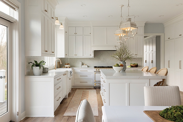
The Lindsays knew it was time for a change after a decade of living in their home, where the kitchen witnessed the raising of their three children, all of whom either attend or graduated from Wayzata High School, and the hosting of many celebrations for family and friends. To that end, Marnie Lindsay wanted to elevate the space, which featured dark cabinetry and out-of-date granite, to a space awash in new, bright and cheerful elements.
The next step included finding an interior team to take her vision and make it come to life. After following Martha O’Hara Interiors’ Instagram account and seeing some of the other projects its team had done, Lindsay says she knew she wanted to work with the design group for her own remodel. (The interior design firm designs and furnishes homes from its studios in St. Louis Park and Austin, Texas, and has done extensive work in the Lake Minnetonka area.)

“The renovation was a collaborative effort,” Lindsay says. “We worked closely with our designer, our builder and our cabinet maker. They listened well and worked hard to create the design we wanted.”
One of the most important facets of the updated kitchen was its improved capacity for entertaining, and Lindsay says the accessibility of the new kitchen plan makes hosting people a delight. “The new kitchen has a place for everything,” she says. “It makes it a joy to entertain.”
Lindsay looks forward to having people over during the holidays, but first—there’s a tradition to tend to. “I enjoy baking during the holidays,” she says. “Our family enjoys decorating Christmas cookies together, so we have a cookie decorating party.” Let the mixing and fixing begin!

hardware—“We did go back and forth between [polished nickel and gold], and we were just drawn to the gold,” says Elizabeth Darth, senior interior designer with Martha O’Hara Interiors. “We could have gone either way, but there’s a hint of gold in the range, and we just felt like we wanted to bring that in not only on the hardware, but on the lighting above the sink. We liked the warmth of adding a gold finish to the hardware.”
beverage area—The area not only offers a secondary prep sink, but there’s a beverage fridge (to the right), which offers accessibility for guests to self-serve. A small cabinet (to the right) that touches the cabinet top has its own purpose. “We did that at a very specific height because [Lindsay] has a hot cocoa machine that she puts in there, so it’s kind of a drink area for entertaining,” Darth says.
white-tone paint—“They did have some existing painted millwork in their house already,” Darth says. “So, we basically matched it with a nice white with just a hint of warmth to it. There were some conversations in the beginning of, ‘Do we do a pop of color on the range? Do we do a contrast color on the island?,’ and the more we looked at [Lindsay’s] inspiration images, she just kept going back to all white, so that’s where we ended up.”
the range—“That was one of the first things we started with,” Darth says. “[Lindsay] knew she wanted that [La Cornue] range … I really feel like we made the right decision in keeping it neutral [in color]. Just the detailing of that range is kind of a showstopper; it’s very unique.”
switching the island orientation—“There was just a wide space between the island and the dinette, and the island was very short,” Darth says. “When we were at the cabinet meeting and started talking about space and how many stools can you get, I said, ‘You know, I really think we need to change the orientation of the island.’ It just kind of came to me after seeing the layout that it wasn’t working; you couldn’t get a very big island out of it the way that it was. Once we switched it, it all made sense and made quite a difference.”

countertops and backsplash—“It is quartz, so it’s very durable,” Darth says. “We kind of knew we wanted to do that small height. We again looked at different options and tile, and [Lindsay] was just very drawn to that full height countertop and backsplash carrying the countertop. We went and looked at different quartz options because she wanted the durability of the quartz verses marble. She does a lot of baking, and she didn’t want to be afraid of the counters [getting damaged] …”
gas, two-side fireplace—“On the one side, they have their casual dining with the TV above it because sometimes, if they’re cooking or in the kitchen, they want to have the ability to see the TV, or for entertaining if there’s a [sporting event] on,” says Darth. “We redid the face of [the pre-existing fireplace] and the millwork around it, which just adds to the ambiance and coziness.” The other side of the fireplace faces the main floor living room.
light fixtures—“When we went to the home initially, [the light fixtures] were fairly new, and we liked them,” Darth says. “We were all in agreement that there was no need to replace them.”
mixer stand—“There is a pop-up stand for the mixer. [Lindsay] likes to bake, and she is a little bit shorter, as well, so we talked about that when we were doing cabinets,” Darth says. “… We thought it would be great to dedicate a space to it because they are so heavy to lift in and out of cabinets.”
Martha O’Hara Interiors, 9950 Wayzata Blvd.,
St. Louis Park 952.908.3150 oharainteriors.com
@ohara_interiors
Interior design and photo styling by Martha O’Hara Interiors
Remodel by Thompson Construction LLC


