Marilyn Turner is a story keeper, a guardian of tales told through collections of weathered stones, culled pottery and the silent secrets kept by the Saint Paul bungalow she shares with her husband, Clarence. As a retired librarian, Turner is partial to narratives, and when it came time to renovate the 1920s-era home’s kitchen, the couple was committed to preserving the home’s original vibe, right down the four layers of floorcoverings to its staple-marked wood floors. “It just tells a story,” Turner says of the wood.
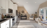
The Turners purchased their home in 2001, and its cozy nooks, alcoves and enviable built-ins perfectly fit the empty-nesters’ lifestyle—mostly. True to its era, the kitchen space was limited, meal prep was confined to 4 feet of counter space, and the traffic pattern was confused by three doorways on three of the walls. “Careful attention to necessary traffic patterns and the exploration of hidden opportunities enabled us to provide a kitchen that meets the owners’ desire for a purposeful and functional modern kitchen within its original footprint and on budget,” says David Heide of David Heide Design Studio.
While the Turners wanted a more functional, modern kitchen, they refused to compromise its character. The Design Studio’s team worked with the couple to dovetail its needs and budget with the bungalow’s aesthetic sensibilities. To begin, after a trial period, the Turners realized they could function with only two doorways, which translated into gaining more counter space. In choosing the countertop, they went with soapstone, typically found in homes of the 1920s. Some may caution against using the softer stone in a kitchen, but that characteristic made it more appealing. Turner wanted the countertop to express itself through routine wear.
Every square inch of the kitchen is utilized. “Coupling space-saving appliances and thoughtful storage solutions with a simple work layout affords the kitchen new functionality,” Heide says. A shallow built-in wall cabinet (“It’s a Mason jar deep,” Turner explains) holds pantry items. A European-style (tall and narrow) refrigerator, coming in at only 24 inches wide, offers space-saving elements. A recessed shelf, providing a platform for small appliances, rests on the counter and features wide drawers. Even a built-in small tray is squirreled away in a lower cupboard that houses the trash receptacle, to hold bag ties, rubber bands and the like.
A toe-kick heater is tucked below the sink in a cabinet, which features cutouts in the doors and toe-kick to allow for heat flow and visual appeal. Matching cutouts add subtle nostalgic charm to a bi-fold countertop door, which secures kitchen privacy or opens up to a counter pass-through to the dining room. Open shelving offers a showcase for the couple’s pottery collection. “It’s one of the things we’ve collected since college, “Turner says, noting they use the pottery as serving pieces and as art elements, appreciating its aesthetic appeal. “That was really important to us,” Turner says of the shelving for the pottery.
Quiet design decisions speak volumes about Heide’s attention to detail. A section of the countertop protrudes out from one doorway. The counter peeks out just enough to offer a perfect resting spot for a cup of coffee or tea. To ensure visual and period continuity throughout the first level, millwork profiles from the front of the home were mirrored in the kitchen.
Perhaps the cherry atop the treat is the kitchen’s original, functioning doorbell above the pantry cupboard. Despite wearing a coat of many painted colors, Turner felt it was worth saving. “It had layers and layers of paint on it,” she says, but it has since shed its outerwear, revealing the original finish.
While the Turners trusted the design team and contractors, they weren’t afraid to get their hands dirty. Piece by piece, on 20-inch boards, the couple positioned stratums of tile, which added a spray of color and interest against the kitchen’s subway-tile backsplash. Given the Turners’ penchant for handcrafted artistry, it was natural for them to actively participate. “We really love handmade stuff,” Turner says. “I think you can see the labor involved. You can imagine the people making it.”
Kitchen renovations can cut a wide swath, chewing up budgets and best intentions, but the Turners resisted. “This is a modest house,” Turner says, adding that it was important to the couple to respect the home’s architectural proportions. Brad Belka, project manager, says, “I think the project is really a good example of the fact that you don’t have to live in a mansion or have a million dollars to have really good design work in your house.” The Heide team understood the couple’s point of view and worked in partnership. “They were so open to collaboration,” Turner says. “It wasn’t like we were 20-something [years old]. We knew what we wanted.”
Nathan Shanklin and the team with Next Level Renovation took the designs and made them a reality. “They continued our collaboration with the project, helping us stay on budget and live comfortably in the house during construction, including not letting the two cats get outside—no mean feat,” Turner adds.
David Heide Design Studio received a National 2016 National Kitchen and Bath Association Design Competition award in the Small Kitchen category for its work on Marilyn and Clarence Turner’s Saint Paul bungalow.


