Like many longtime Minnetonka residents, Josh and Mae Tunks fell in love with their property: the quiet street, the wooded lot with plenty of shade, and the proximity to their extended family. But their aging rambler itself? Not so much.
In 2009, the Tunkses purchased their Minnetonka house, which was built in 1969, from the original owner. “The original olive-and-teal shag carpet and gold-flecked Formica countertops were included,” Mae says with a laugh. Mae and Josh are both from the lake area, and they decided to move back from Minneapolis for the great schools and to be closer to their families. Soon, they knew it would be time to renovate. “We had been dreaming about it since we purchased the original home,” Mae says. “The birth of our fourth baby really put the squeeze on the existing space, and the pressure was on to make things more comfortable for our larger family.” (The Tunks family includes Lillian, 12, Zinnia, 9, Poppy, 6, and Oscar, 3.)
They launched their major project with Wayzata-based Revolution Design and Build, headed by principal Sid Levin and partner Rob Aldecocea, and finished it before Thanksgiving last year.
“We call this a ‘tear-down,’ ” says Levin, “but Josh and Mae like to refer to it as a ‘scrape.’ ” After drafting several options for the renovation, it quickly became clear that the most efficient path was to basically rebuild the entire home from the foundation up. The new home, which makes incredible use of the original footprint, has about 2,800 finished square feet. The Tunkses were adamant that they didn’t necessarily want more sprawl. “We didn’t want a huge house,” says Josh. “We wanted enough space for all the kids. We originally weren’t going to build a second story; we wanted to keep it low and flat. We liked the ranch layout, that it works with the environment.”
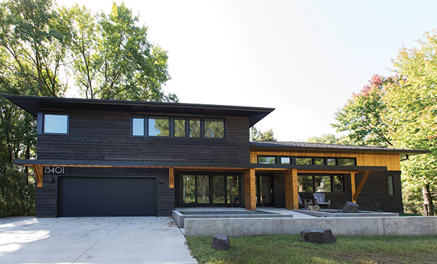
In the end, they ended up adding a second story above the garage to accommodate the kids’ bedrooms and bathroom, but the whole vibe is still decidedly low-profile. “It still fits in with the neighborhood,” says Mae. “It’s not a bunch of ramblers and then, all of a sudden, a big box.”
It was important to the Tunks family that their new home be practical, energy-efficient and eco-friendly. Levin explains, “When we interview the clients, we don’t ask them what they want [for features]. We ask them about how they live, and how they use their house. We figure out what they’re going to do in each room.” So the house is smart, in every way: efficient, functional and beautiful, with a Scandinavian-minimalism-meets-Japanese-Zen aesthetic.
The First Floor
Walk in the front door and you’ll see the dining room on your left, with floor-to-ceiling patio doors (really, a whole window-wall) that open to the front porch. Keep walking and you’ll enter the back hallway where the house meets the garage. There are coat hooks along the wall and kids’ paraphernalia here and there. The Tunkses say they could’ve designed a larger mudroom, but that only invites clutter; keeping each room in their house to a reasonable size forces the family to edit the items that are stored in any given area.
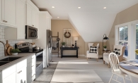
Through the hallway is Mae’s overflow cooking area, a small vestibule off the kitchen (with a door that can close it off). Levin says, “This is Mae’s safe zone, with an extra oven and a place where she can have her baking stuff, and cook muffins, cookies or breads.”
“I worked for nine years as a contractor in a cookbook test kitchen,” Mae explains. She’s constantly cooking and baking, and having a small space that’s just hers—without kids or pets running through—was key.
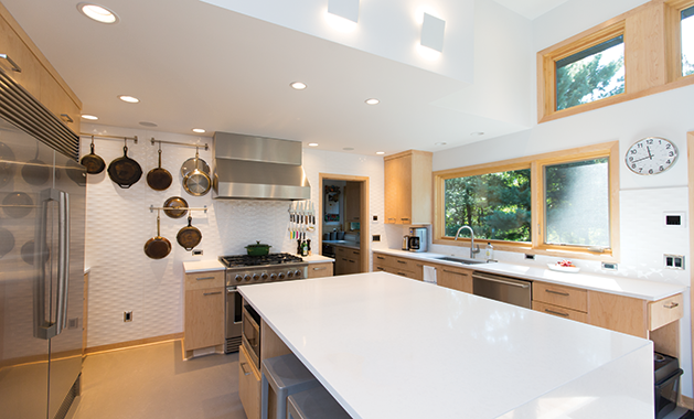
The main kitchen, of course, is also a professional cook’s dream. “I have a big refrigerator and freezer because I cook all day long,” Mae explains. “I didn’t want to have to run to the garage or basement for a big chest freezer.” There’s a clever storage area for kids’ snacks, and a large island where kitchen visitors can gather to chat or eat.
All of Mae’s knives, pots and pans are hung on the wall. “There’s no hiding,” says Levin. “This is a house that’s all about saying, ‘This is what we do and where we do it.’ ”
Mae adds, “It’s like a tool bench with wrenches and screwdrivers and hammers—it helps me immediately find the one I want. If it’s not hanging up, I know it has to be in the dishwasher; there’s no hunting.”
The simple and beautiful Caesarstone countertops are from Great Northern Granite. “Caesarstone is timeless, hardworking and durable,” says Levin. In fact, the Tunkses used the same surface throughout the house, in the kitchen and all the bathrooms. It’s both greener and more affordable, Levin explains. “The more of a slab you use, the better.”
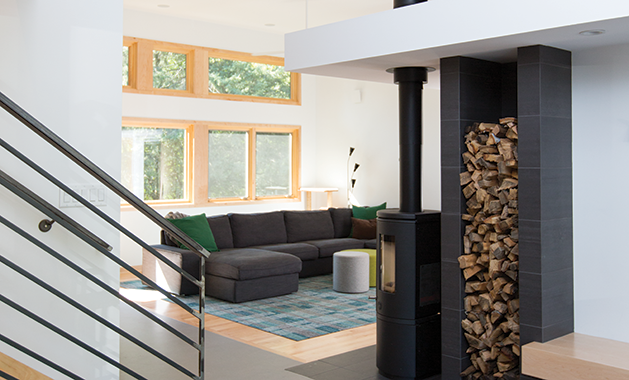
The kitchen opens directly to the family room, which includes an entertainment center and comfy sofa. There’s a small office/music room, with one partial wall that lets light and sound flow across from the family room. “That way, whoever is working in there can be not totally isolated from the rest of the family,” says Mae. “We also have a piano in here, so we can hear the kids practice.” A focal point of the family room is the woodstove, reminiscent of those found on the porches of cottages in Norway and Sweden. “We had to have the stove,” says Mae. “It’s more efficient than a fireplace. In the winter, it heats the first floor, so the furnace never has to kick in.”
Last (but certainly not least) on the main floor is the master suite, which includes a cozy bedroom and bath that share a tiny hallway. The magic is in a sliding barn door, which can close off the suite from the family room. “We can shut this door and be totally in our own space,” says Mae. “We didn’t have that at all before—no privacy. There’s even extra insulation in this wall [which separates the suite from the family room] to help block the sound.”
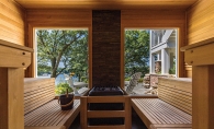
The bedroom has a great view of the wooded backyard—but the bathroom is the pièce de résistance. There’s a beautiful cedar sauna, accessed through the walk-in shower, which adds authenticity to the home’s Scandinavian vibe.
The Second Floor
Upstairs is the Tunks kids’ domain. There’s a little nook for hanging out at the top of the stairs, and eldest daughter Lillian has her own tween nest facing the backyard. Mae points out some funky Ikea side tables that double as storage for stuffed animals. “She’s too big to want them all over the bed,” says Mae with a smile.
Poppy and Zinnia currently share a room (by choice), and the third bedroom is a play space, ready to be converted into a sleeping room for one of the middle girls when they decide they’re ready for their own zones. The fourth bedroom belongs to 3-year-old Oscar. The rooms open off a small landing, and the last door leads to the smart kids’ bath. It includes a center space with a big counter (double sinks and double mirrors), and two toilet/bath areas, one on either end. “This is my favorite,” says Mae. “There are two tubs, two potties and two sinks, so we can have multiple people in here. I can separate the kids and do it all at once, and not take five hours to get everybody through the washing.” As with all the other rooms in the house, the bathroom isn’t oversized, just efficient. “I have to clean it myself,” says Mae. “I don’t want some 5,000-square-foot mansion where everybody has their own suite.”
Levin adds, “It also helps keep the carbon footprint small. This house is super-green.”
The kids’ bath has the same Caesarstone countertops as the kitchen and economical acrylic tubs (“I didn’t want to have to clean grout in a children’s bathroom,” says Mae). There’s cute penny-round tile for the flooring and practical large subway tiles to make a wipeable wainscoting. All of the wood throughout the home—doors, flooring, trim, cabinets—is maple. “That Scandinavian design allows us to use plywood,” says Levin, pointing to maple wainscoting opposite the kids’ sinks, which is set with plenty of hooks for towels.
Mae points out one of her favorite details: “For hardware, we picked longer handles for the vanities and the kitchen sink, so we can hang a towel there and we don’t have to have a separate towel rack.”
“It’s that less-is-more design style,” adds Levin. “Why wouldn’t we add a big handle and use it as a towel bar? It’s functional and ergonomic. It’s thought-out.”
On the Outside
The home’s exterior is a stunning combination of bright and dark. For siding, there’s tongue-and-groove natural cedar, black-stained cedar (which mimics shou sugi ban, a traditional Japanese technique that chars cedar to weatherproof it), and black aluminum.
Josh and a crew of family and friends laid a patio with granite pavers salvaged from Minneapolis’ Nicollet Mall renovation project. “They were selling them on Craigslist,” Mae laughs. “Josh and my dad got a bunch of pallets of the pavers, which were the sidewalk on Nicollet Mall. We also have one streetlight that we’re going to put on the patio.”
The landscaping is simple and striking. The front “porch” is concrete, surrounded by a Japanese-inspired garden with rocks and ornamental grasses. “The grasses will mature and give a little bit of privacy to the dining room,” Mae explains. There’s a ramp instead of steps up to the front door, to offer accessibility to visiting older family members, and for ease of snowblowing in the winter. And the front yard is planted with native prairie grass and flowers. “I hand-seeded it,” says Josh. “This is MnDOT’s mesic prairie mix, and I bought the seed from a local seed company in Eden Prairie.” The Tunkses seeded the garden last fall, right before the first snow, and waited all winter to see what spring would bring. By June, the yard was alight with waving grass and colorful blooms.
